- Behind the scenes at Usborne
How to create awesome sticker books

Meet Simon Tudhope, the writer behind the sticker books that let you Build Your Own… cars, dragons, robots and more.
Seven years ago, Usborne designer Marc Maynard and I sat down to plan the first book in a new series. We had a title: Build your own Cars. And a concept: a ‘jigsaw’ sticker book. But what was its personality? This might sound like a strange thing to ask about a book, but if our book were a superhero, who would it be? Professor X – the teacher, Captain America – the responsible adult, or Spiderman – the kid who thinks this whole superhero thing is so awesome. We went with Spidey.
Right from that first planning meeting, our aim was to create a book for children who LOVE cars. It wasn’t to teach the mechanics of how they work, or the history of how they’ve developed, it was simply to show why they’re so much fun. And we did this by assembling a line-up of the most amazing cars we could find, and then explaining in as few words as possible what makes each one so great. To hammer home the Top Gear / Top Trumps vibe, we added a statistics box, so you could compare each car’s strengths and weaknesses.
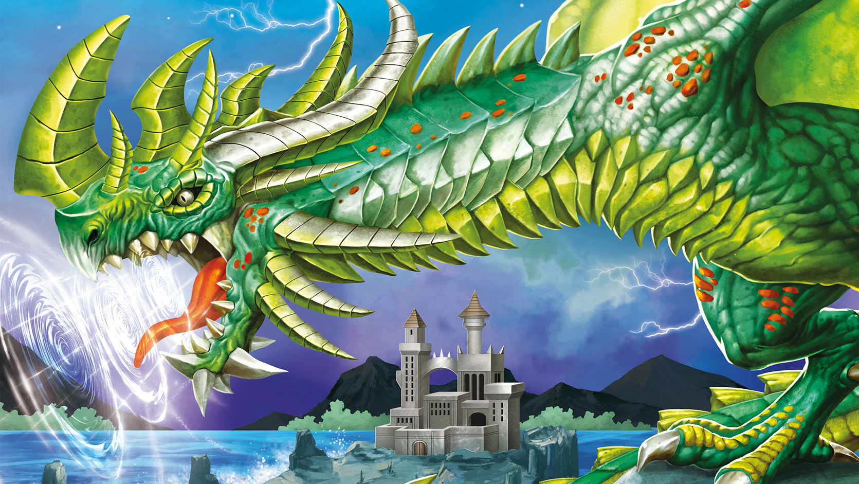
As the series has progressed, we’ve moved into the realms of monsters, dragons and aliens, but the approach is still the same – if an idea doesn’t grab the attention of the six-year-old inside, then we turf it out and go back to the drawing board.
So let’s talk specifics. Once we have the idea in place, the next step is to work out the best way to present it on the page. There are always two things we need to keep in mind. The first being that this is a sticker book – so whatever we’re showing has to be bright, colourful, and also the right shape to fill the page. An alien warrior who’s completely invisible except for the shadow they cast (let’s call her ‘The Shadow’) might work brilliantly in a comic book, but it doesn’t give you many interesting stickers…
The second thing to keep in mind is that we need to show the subject doing something interesting. So rather than having a dragon with a clubbed tail sitting on a rock and writing that it could smash through a stone wall, we actually show it in mid-air, in mid-swing, smashing through the wall of an impregnable fortress. This not only makes the picture more interesting, it also helps with the text. Being able to write in the present tense (‘smashes’) rather than the conditional (‘could smash’) makes the description come alive.
Finally, once we’re happy with the design, we send it to our illustrators. Finding the right illustrators has been crucial for this series. Gong Studios are based in Indonesia, and are steeped in the sci-fi and fantasy worlds we’ve moved into. Their pictures essentially provide us with two things. Firstly, the character itself, be it monster, alien or fantasy warrior. This is the main component on the page, and where all the stickers are placed. Secondly, they provide us with the background – which gives our character a world to live in, and gives us our story. When you put these two things together, you have a book that works not only as a sticker activity, but hopefully as a launch pad for some stories of your own…

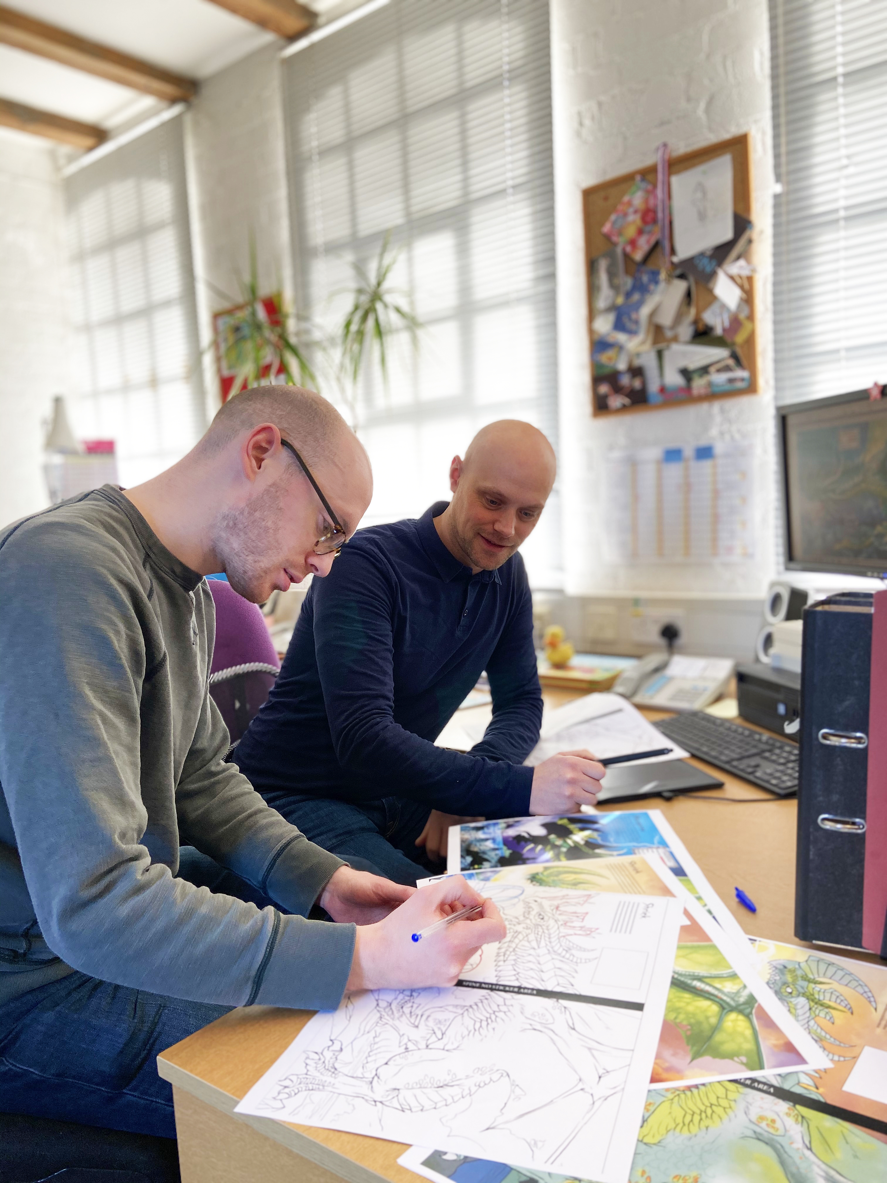
Simon Tudhope (left) and Marc Maynard, the team behind Build your own...


